 Did you have a good Christmas? I did. I got to spend time with family and eat a lot of good food (now I have to get back to the gym). For a photographer, Christmas is filled with lots of opportunities to take photographs. There is a tendency to try to photograph everything, which I think is a mistake. The subjects in our photographs can become irritated if they are constantly being photographed. There are also several events that are very fun to participate in, but are not much fun to look at later. I put opening presents in this category. I have looked at lots of pictures of people opening presents and I find them boring. I also find the rushed nature of opening presents often yields photographs that are blurry, or poorly composed, or poorly exposed, or a horrible combination of all three. The subjects are seldom caught at their best either. The one exception to this might be children opening their presents, but even then one should be careful not to overdo it or you end up with lots of photographs that are all basically the same.
Keeping that in mind, I went out of my way to deliberately take only high quality photographs of the family members this year. We spent Christmas Eve with my wife's family. There was another photographer there who was taking photographs and we all worked with her to get some group portraits. She was doing a fine job, and I saw no reason to take photographs myself at this event, so I left the camera in the bag for the most part.
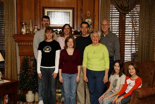
On Christmas Day we were at my Father's house and everyone was interested in a family portrait, so we spent some time choosing a location and I set up my tripod and began taking test shots. The background we chose had two windows in it. What typically happens is that I expose for the lighting indoors and the highlights in the windows get blown out completely. I was very conscious of this and metered for the windows instead. I love the look of a photograph where the subject are properly lit, but you can also see what is outside the windows as it just looks more natural.
Metering on the windows meant the indoor part was going to be very dark, so I had to use the flash to properly light the subjects. I played with bouncing the flash off a few different walls, but ultimately settled on bouncing it off the ceiling as the best choice. I also used the "better bounce card" to throw some of the light forward. I settled on ISO400, 1/125th shutter, and F/9 with +1/3 flash exposure. By putting the camera on the tripod I was able to use my remote shutter release and this made being in the photograph myself very easy. We took about 8 exposures and reviewed them each time making changes to where people stood, how they held their arms, etc. The photograph at the top is the culmination of our efforts. The size presented here does not give the best viewing results, so I encourage you to click on it and look at a larger version. It is not perfect, but I was pretty happy with the results.
The number one thing wrong with this photograph?...the bright flash reflection in the picture behind the subjects. I knew this was going to be a problem, but I got caught up in all the other details, and never changed the position of the camera. I probably could have moved the camera 5 feet left or right and eliminated (or at least reduced) the flash reflection. This is the kind of thing that I may be able to fix in the post processing stage as I learn more about PhotoShop and similar programs. For now, I am just going to have to live with it and hope the family is not too disappointed.
The bottom line is that we spent maybe 20 minutes on photographs, and then I simply enjoyed the rest of the day. I also don't have a ton of boring photographs that no one will care about looking at later. A few of the other family members used their point and shoots to take a few photographs, but they also kept their exposures to a minimum and only took specific shots they were interested in. Now, don't get me wrong. I like to take LOTS of photographs, and I frequently overshoot a subject, especially when I am experimenting with lighting, composition, etc. This is an excellent way to learn. I just feel family events call for a more measured and calculating approach so the subjects don't get burned out, the photographer can participate and have fun, and the end results will be something everyone wants to see.


5 comments:
Chris- one thing you could try for the blown-out highlight in photoshop is to make a selection around just the picture, then go under "adjustments" and choose "exposure." Lower it until it looks better. It still won't look great- because it is completely blown out- but it might help improve the overpowering nature of that particular highlight. :)
Thanks, Blue. That is a good idea. I did something similar which is to burn the highlights inside the frame. This toned them down quite a bit and make it not so noticeable. Here is a link to the new version. Let me know if you think that is better.
http://www.flickr.com/photo_zoom.gne?id=2139653507&size=l
very nice,
you have some very good work on this site.
would you mind if i added a link to this blog on my photo page?
Thank you for the kind words, David. You definitely may link to my blog from your site. Please provide us a link so everyone can see your page as well. Thanks.
Chris
Yes, that looks a lot better. :) I was going to mention burning, but didn't because it is a skill that I have not personally mastered yet. Whenever I have tried either dodging or burning, it has come out completely awful... so I have found some alternate methods that seem easier for me. A lot of photoshoppers swear by these methods, though, so maybe I should work on it. It's a great picture, though, a really nice memory for your family. :) Happy New Year!
Post a Comment